Galaxies hang out in groups on top of dark matter halos that we can’t see. Figuring out where one group ends and another begins is thus a tricky but critical first step in figuring out how galaxies are affected by their environments. I’ve been playing with interactive plots generated with Plotly to better understand the output of my group-finding efforts.
Here, we’ll use some of the public data from the EAGLE simulations. These hydrodynamical simulations evolved a stupidly big number of particles in a CDM cosmology to explore the evolution of the universe. The EAGLE database provides snapshots of the universe at different redshifts which include many characteristics of dark matter halos and the galaxies that reside in them.
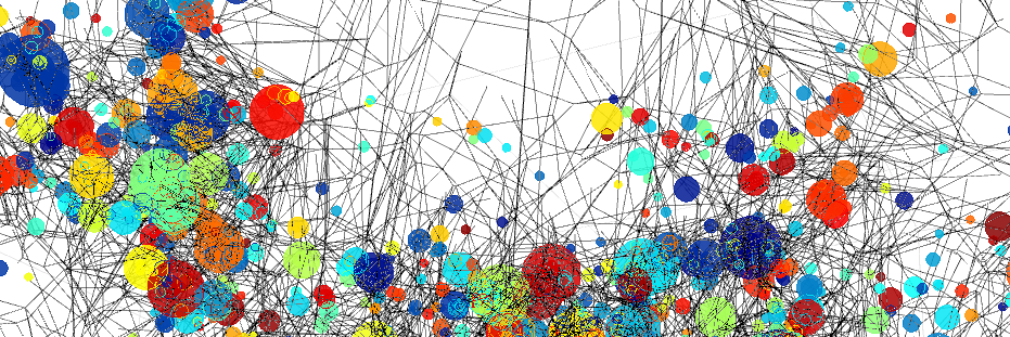
For this plot, I used the 50 Mpc, z=0.37 RefL0050N0752_Subhalo table, which includes the positions and masses of galaxies and which dark matter halo they reside in. I included only galaxies with stellar masses > M which are shown by circles on the plot with radii that reflect their masses. Each galaxy group is assigned a random, unique color. I generated the Delaunay mesh of the set and plotted all vertices in the mesh that connect first order neighbour galaxies separated by < 1.25 Mpc (comoving). Just looking at the Delaunay mesh is far from a robust way to recover group structures in a sample (but it’s an important in serious group finding algorithms, e.g. Gerke et al. 2012.) Nevertheless, if you zoom in, you can see that connections emerge pretty reliably for large groups.
The python code to generate this plot is here.