I really like Sankey Diagrams for visualizing the performance of classification models. I couldn’t find a library to make these plots look the way I wanted them to so I wrote some python code to do the job with matplotlib a couple of years ago. It sat forgotten for a long time, but I recently remembered its existence while working on a paper about classifying stars, galaxies, and AGN.
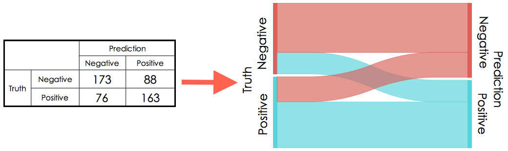
A Sankey diagram can be used as a visual representation of a classifier’s confusion matrix. For example,
I’m finishing up a paper on using XGBoost to classify objects in my ugrizy CLAUDS HSC-SSP catalog. I use optical imaging data from the Hubble Space Telescope and x-ray spectroscopy in the COSMOS field to build a complete sample of labelled objects to train a model to classify sources based on their colours and morphologies. For stars, galaxies and type I AGN, the classifier does very well, but type II AGN don’t have any distinctive features in the optical regime (they just look like galaxies.) In fact, they end up polluting the other classes. In the end, for science that depends on these classifications, I toss them and use a 3-class model since I only care about throwing out all the non-galaxy junk.
Stay tuned for the paper on all that, coming soon to an arXiv near you. For now, here are the results of the star/galaxy/type I AGN/type II AGN classifier in Sankey Diagram form.
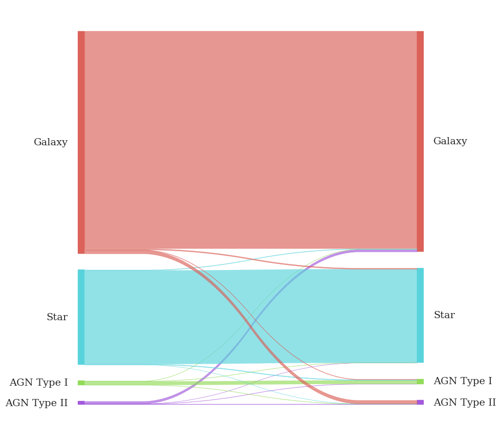
Well then. That’s not very informative.
In a flux-limited survey of any reasonable depth, there are waaaay more galaxies than stars and waaaaaay more stars than AGN. We carefully deal with this class imbalance in training the model, but is there anything we can do to make this diagram more intuitive?
Enter the Normalized Sankey Diagram. Is this already a thing? If so, I’ve independently discovered it, much like that diabetes researcher who discovered calculus in 1994. Here, each object is assigned 2 weights, one on the truth side, and one on the prediction side. The weights are selected to give every class equal visual representation on either side of the diagram. Thd width of the left side of each strip represents the fraction of objects which truly belong to a class that the model predicts as belonging to one of the output classes. The width of the strips changes across the plot so that the width of each at the right side of the diagram represents the fraction of all objects which the model predicts as belonging to a class which truly belong to each of the classes.
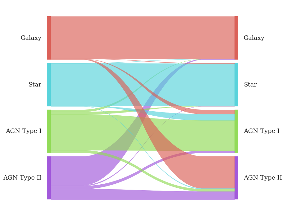
Now, it’s easy to see that more than half of type II AGN are classified as galaxies, but more-than-half of them is negligibly tiny compared to the set of objects the model says are galaxies. The purity of the galaxy sample is barely affected by the type II AGN getting shoved into it. Similarly, the handful of real galaxies that get classified as type II AGN doesn’t really affect the completeness of the output galaxy sample, but turns into the majority of objects the model thinks are type II AGN.
The code used to make these diagrams is here: github.com/anazalea/pySankey. Big thankyous to marcomanz and Pierre-Sassoulas for their very useful contributions :)