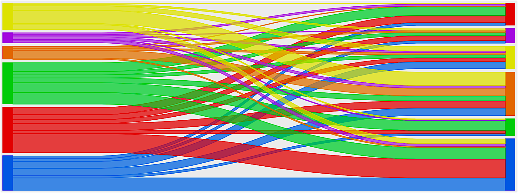
Normalized Sankey Diagrams
I really like Sankey Diagrams for visualizing the performance of classification models. I couldn’t find a library to make these plots look the way I wanted them to so I wrote some python code to do the job with matplotlib a couple of years ago. It sat forgotten for a long time, but I recently remembered its existence while working on a paper about classifying stars, galaxies, and AGN.